
The Secret to Decorating with Dark Colors
M. James Design Group, an Austin interior design firm, explains the secret to decorating with dark colors using their featured House Beautiful apartment. Photos by Douglas Friedman.
Before You Start Decorating with Dark Colors, You Need to Listen to What the Home Wants
Every home has a story it’s waiting for you to uncover. It just takes a good listening ear. While it may sound unconventional to some, this is our Texas-based interior design firm’s approach to dark colors. Our own pied-a-terre was recently touted in House Beautiful for its moody palette of dark blacks, grays, and gold accents. We’re going deeper and sharing our secret to decorating with dark colors that allowed our home’s story to come to life.
Decorating a House is Like Finishing a Puzzle
Decorating a house is like finishing a puzzle, and, like any good puzzle, it never really seems to end. For example, we love collecting art. Rather than buying art to match our decor, we focus on creating a collection that represents us. The key to solving the puzzle of display lies in unifying the space through color. In this case, it was using dark colors. Design is less of a set plan and more of an exploration, which is fun once you embrace it. Play around, and you’ll solve the puzzle when you least expect it.
Painting Dark Colors Takes Some Planning
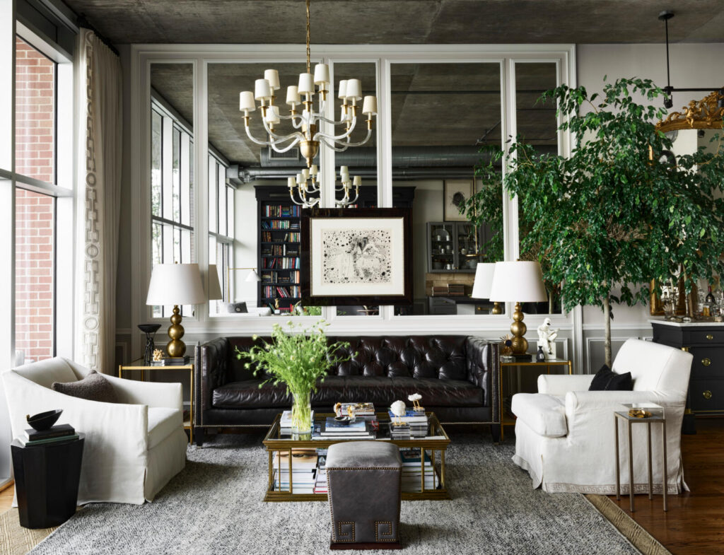
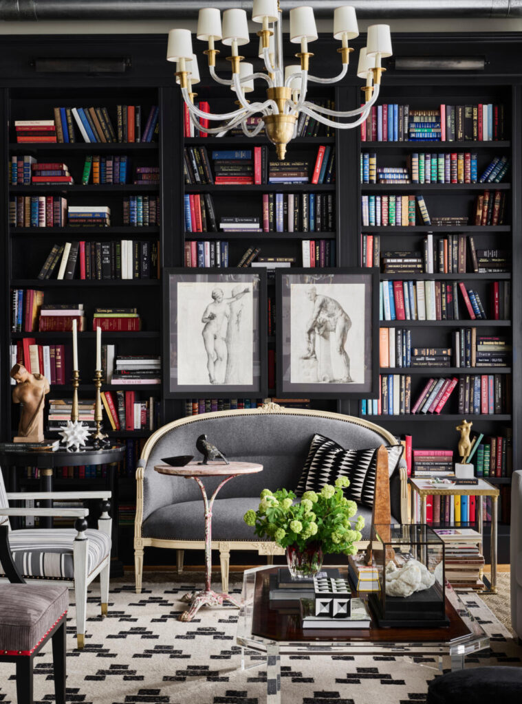
That’s not to say decorating with dark colors doesn’t take a bit of planning and research. Melinda has been dubbed our firm’s unofficial president of paint. She spends a lot of time making paint selections at the start of a project, explaining, “Paint is the most important decision for the look, feel, and cohesion of a home.” In our Houston Museum District apartment, we used Black Jack by Benjamin Moore, and this unifying backdrop color pulls together our art, book, and decor collections.
Considerations to Keep in Mind When Using Dark Colors
These are some of the main considerations we keep in mind when using dark colors. They all involve tapping into the story of the space and listening to what the home needs from the design.
A Sense of Place
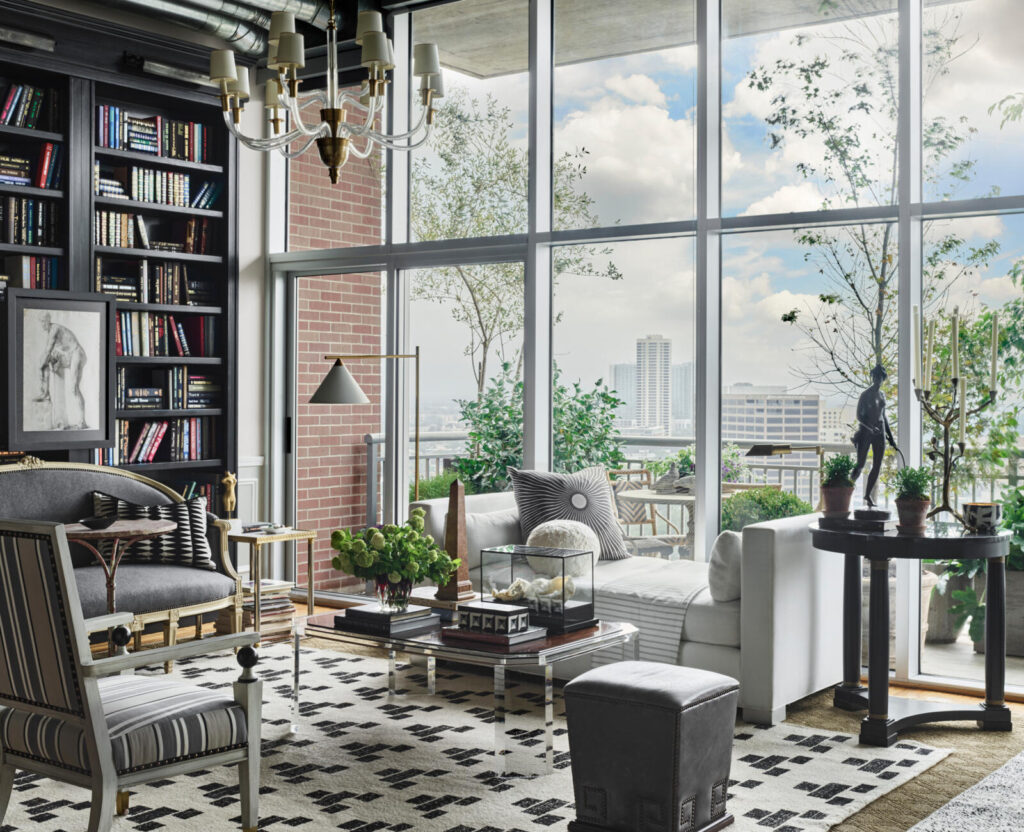
Colors don’t exist in a void. Instead, a home has a sense of place that should be reflected in the design. For example, coastal homes lend themselves to an off-white palette that reflects the sand and sunshine. On the other hand, our 17th-floor pied-a-terre had a much more urban feel. Blacks and grays tied in the city skyline as well as the apartment’s exposed concrete and piping.
Indoor, Outdoor Connections
We blend the indoors and outdoors through our designs, expanding the livable space. Doing so carries the colors between the areas so there’s no drastic change between them. Since the outdoors are often naturally brighter, it’s beneficial to create a gradient from dark to light in order to bridge the gap.
Natural Light (and Its Changes Through the Day)
The natural light that enters your space has a significant effect on interior color use. After all, light is responsible for how we see color. Our Houston apartment faced south, allowing for softer lighting and peekaboo sunset views. However, the interior always had a moodier feel because of its orientation. So, we embraced the darkness with dark colors.
Room Size
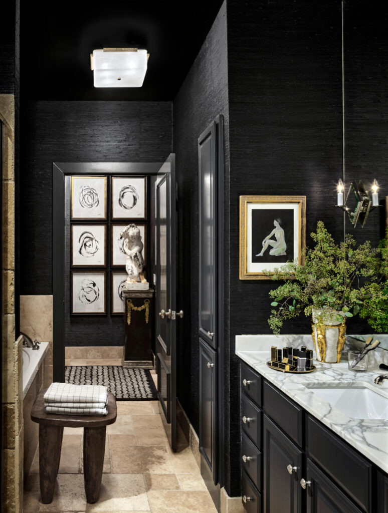
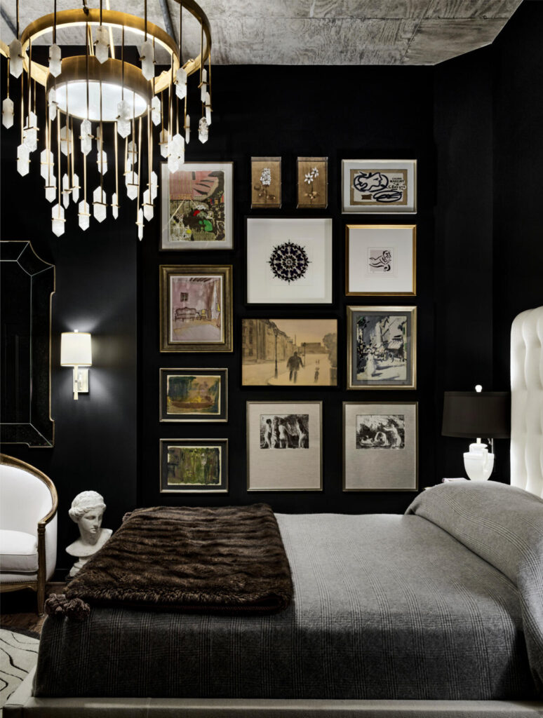
You can decorate with dark colors in any size room. However, small rooms tend to take darker wall colors better. Dark colors make the walls recede, creating a space that feels larger, richer, and more dramatic. In our apartment, we enveloped the bedroom and en suite in black, maximizing the space through color.
Architecture and Layout
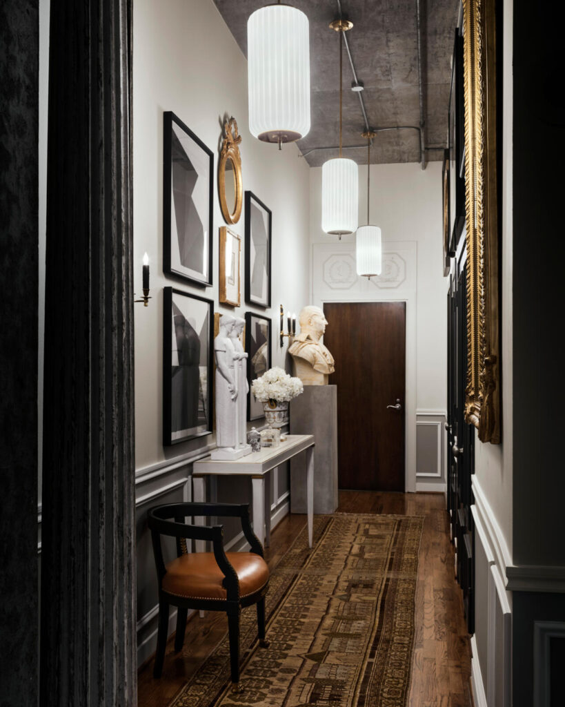
As we said to House Beautiful, “Black hides a multitude of sins.” In other words, you can use dark colors to address concerns and limitations of a home’s existing architecture and layout. For example, our Houston apartment bedroom is closed in by interior walls. We transformed a boxy, windowless room into a retreat by embracing the lack of lighting and wrapping the walls in black paint. It pays to welcome the darkness rather than fight it.
Mood and Drama
John loves that paint colors “create the atmosphere, continuity, and mood” you want people to feel in a space. We both have a love of the dramatic, so a palette of rich and moody black, gray, and gold just made sense for us. If you want drama in your space, flip to the darkest palettes of your paint deck.
Color Pairing and Accents
Using dark colors also allowed us to provide a backdrop to show off our art collections, books, and Neoclassical antiques. In our living room, the black bookshelf highlights all of the book titles. In our bedroom, the black gallery wall plays the curator role, showcasing and uniting our varied collections.
Close Attention to Color Pigments
Painting with dark colors can be challenging to get right. The key is to look carefully at paint pigments, especially the undertones. For example, we often look for earthy undertones, like brown, in the dark paint colors we select. These warm undertones add approachability to colors often considered cold or harsh.
Sometimes You Just Have to Go for It
After rounds of design collaboration and color research, Melinda advises you just have to take the leap and go for it. She’s not a fan of testing multiple samples because it can become overwhelming for clients to choose a tiny splotch off a massive wall. So instead, we go all in on a wall color knowing we can repaint if we have to. (But that hasn’t happened yet.)
Listen to Your Home
Ultimately, deciding to decorate with dark colors comes down to the home’s location and architecture and the client’s personality and panache. When in doubt, listen to your home and see what it tells you.